Marin Housing Bubble blog

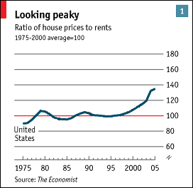
Above is a graph of the yearly price of a Marin house (mean Marin SFR sale price divided by 30) divided by the mean yearly rent in Marin county for each year from 1995 to 2005. Click on image to make larger

The ratio of yearly price to yearly rent is roughly constant up to about 2002-2003 and then goes through the roof. IMO this graph nicely illustrates the bubble in Marin.
From: Marin Housing Bubble Blog

1 Comments:
Hey, thanks for the plug. I should have also mentioned that based on other data I've compiled it looks like the "normal" peak in the "normal" housing cycle was in 2003 but then the bubble happened and things took off from there.
Post a Comment
<< Home